Article Content
There is a whole world of psychology surrounding the use of color and how it can help you market effectively. In this article, we will help you grasp some of the core elements of color psychology and understand better how to use it to your advantage in your marketing efforts.
Some Color Basics
Before we get into the marketing elements of color psychology, let’s look at some basic color principles. Color theory plays as much a role in understanding how to utilize colors for marketing as psychology does, so we’ll start there:
Primary and Secondary Colors
Primary colors are the three colors that make all other colors. These include red, blue, and yellow. All other colors are combinations of these three.
- Red and blue make purple.
- Blue and yellow make green.
- Red and yellow make orange
Tertiary Colors
Tertiary colors are the next level of color. These are created by adding more of one primary color than the other. These are described in terms of the dominant color:
- Red-purple
- Red-orange
- Yellow-green
Pure Colors
Primary, secondary and tertiary colors, without adding white, black, or any other third color, are all considered pure colors. They are intense, vibrant, and highly saturated. You’ll often find these colors on summer clothes, children’s toys, and daycare decorations.
Tones
Tones are created when you add gray (a mix of black and white) to a pure color. They help “tone down” colors by desaturating them..
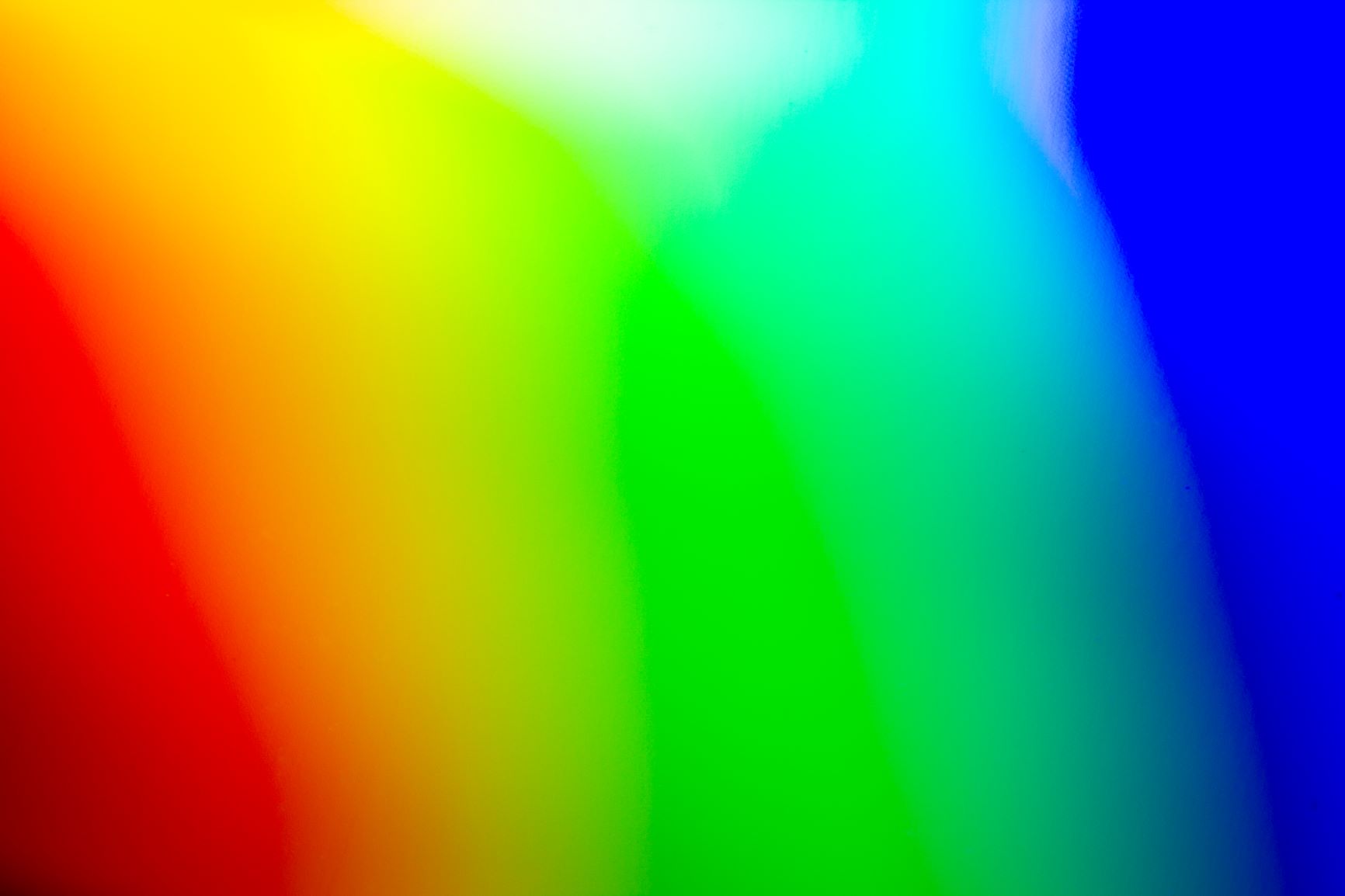
The Color Wheel
These colors complete the color wheel. Cool colors are on the left side of the wheel (blues and greens) and warm colors (reds and yellows) are on the right side.
Using Contrast Correctly
Now that we’ve covered some basics of color theory, let’s look at some contrast elements that are essential. Contrast is likely one of the most important aspects of color composition that you will use..
Simply put, contrast is when one color stands out from another. It is what makes objects and text stand out from the background. So, high contrast is when one color easily stands out, and low contrast is when one does not.
A color difference is not what creates contrast, though. You can have two separate colors that don’t have contrast, no matter how different they are. This happens because they have the same tone.
In pure form, colors have specific differences in how light and dark they are.
Using High and Low Contrast Correctly
High contrast is your best choice for essential content. It’s more easily seen. Dark colors on light colors, or the opposite, is the easiest to read. To that end, this is where you have to be careful with your colors.
Designers tend to prefer low contrast techniques. Designers want to create eye-pleasing elements, but pretty isn’t always the best for readability. Many tone-on-tone combinations are popular, but are unfortunately difficult to read. This is a major factor, as it plays into creating ADA accessible content on your website.
Choosing Color Combinations
The color wheel can aid in choosing ideal color combinations. Keeping these combinations simple is going to help you in the long-term. Consumers tend to prefer simple color combinations. People like straightforward, easy-to-read content. If you use too many colors and busy up your visual content, it can be hard on the eyes and make things a bit of a mess for your audience.
Use Complementary Colors
Complementary colors are opposite colors on the color wheel. These colors make good combinations because of how different they are. Many brands use this method, as it is memorable, distinct, and visually pleasing. Some examples include:
- Blue opposes orange (Fanta, Firefox, 76)
- Red opposes green (Mountain Dew, Chili’s, Heineken)
- Yellow opposes purple (Los Angeles Lakers, Disney Channel, Hallmark)
Using Split Complementary Colors
For three-color combinations, use split complementary color schemes. To do this, pick a color on the wheel and use the two colors adjacent to its opposite.
Using Analogous Colors
Analogous colors are next to each other on the color wheel. They are similar to each other and create pleasing, relaxed visuals. They’re not opposite, jarring, or clashing. They don’t stand out from one another. Consider adding a complementary color if you want an element to stand out.
Using Monochromatic Colors
Monochromatic colors are one single color with tints, shades, and tones. They are softer and more subtle than analogous colors. They work well when you pair them with a single complementary color.
Designers typically pair a rich collection of monochromatic colors with a single complementary color.
Using Rectangle, Triangle, and Square Colors
These types of color combinations go beyond combining complementary opposites. You can simply use a rectangle, triangle, and square on the color wheel to get various combinations.
- A triangle combination is made of three colors that are spaced evenly around the color wheel.
- A rectangle is a color combination made of four colors that are made up of two complementary pairs.
- A square is similar to a rectangle, but the two sets of complementary colors are evenly spaced around the wheel.
Color Psychology in Marketing
Color impacts how we think and behave. It helps us understand where to look and how to interpret something. It also helps us analyze what’s essential and what isn’t. As marketers, it’s essential to understand the psychology behind each color.
Color psychology is moderately subjective, as interpretations vary based on region and culture. As a result, not everyone reacts the same way to the same colors.
However, there are commonly shared interpretations within a region, which allows marketers to color coordinate their marketing materials based on their target demographics. For the sake of today’s discussion, we will dive into western interpretations of color and how those apply to color psychology in North America.
Red
Red is a color that is powerful and dynamic. It reflects our physical needs, how and if we show love and affection, or show fear, terror, and survival. Red is also an energizing color that can show strength and friendliness but is also demanding and can portray a sense of aggression.
This color is best used to create a powerful presence or get someone’s attention quickly. Make sure you use it sparingly, though, since overuse can dominate the image and take away from the message..
Orange
Orange is a fascinating color. It joins together the powerful energy of red and the fun and friendliness of yellow. Because of the combination, orange is a good symbol of physical comfort in food, warmth, and shelter. It can even stimulate our appetite and make us hungry.
Orange is also a color of positive attitude, motivation, and enthusiasm for life in general. Orange can be used for conveying comfort in difficult times and giving a sense of freedom or fun in your visuals.
Yellow
Yellow helps bring happiness, joy: optimism and cheerfulness. Happy things are often associated with yellow. Its wavelength is very long, which correlates to a more potent psychological interpretation. It’s also the easiest color to visibly see.
So, if you’re looking to cheer someone up, enhance their confidence, or create inspiration, use yellow. Again, as with any color, moderation is key, as too much yellow can be overwhelming and leave the reader lost on the page. Yellow is well used in highlight colors and as a complement to other colors.
Green
Green conveys harmony and balance. It evokes a strong sense of morality, incorporating both logical and emotional traits. It is often seen in nature, showing life, rest and peace. It can also be a sign of growth. The growth can be physical or monetary, so it is a great color to convey possibilities to your audience.
Green is the color to use if you want to depict nature, rest, health, and stress relief. Although generally a positive color, some negative interpretations of the color may include materialism and over-possession.
Blue
Blue represents trust and dependability. It shows reliability, responsibility and is mentally soothing. These aspects have made it one of the most popular colors across the world.
Blue creates more of a mental reaction than a physical one. It helps us de-stress, calm down and think contemplatively about our situation.
Blue is also one of the last colors to be seen, and it can be viewed as distant, and unfriendly when used excessively.
Purple
Spirituality, royalty, and imagination are what purple is typically known for. It has energy from the red and the reliability and stability of blue. This creates a balance between the physical and the spiritual. Purple is used to show loyalty, luxury, mystery, courage, and magic.
Purple soothes but also conveys mystery and new ideas. Creativity is often depicted with purple.
Just remember not to use this color too often, as it can create the feeling of excessive introspection or distraction as thoughts begin to wonder.
Black
Black represents sophistication, control, seriousness, and independence. Sometimes it is used to show mystery, evil, depression, and death. Black is a reserved color that lacks any light since it is absent of the particular colors it consists of.
Black is great for high contrast and easy legibility. Black can be used consistently and throughout as it is simple and draws attention away from itself and to other elements that contain simpler colors.
White
White is complete and pure, representing purity, peace, innocence, and cleanliness. White also represents new beginnings, creating a blank slate, and provides a feeling of refreshment and new ideas.
Since white has an equal balance of all colors, it has several meanings. It’s excellent when conveying a sense of cleanliness, simplicity, and new ideas.
White can be used widely or sparingly, but too much white conveys a sense of incompletion, anxiety, and unassuredness as the eye doesn’t know where to go. Keep this in mind when designing ads, webpages, and other visual media for your brand. .
Branding and Design Doesn’t Have to Be Hard
At Carbon Digital, we specialize in developing effective branding. As part of our work, we’ve analyzed the ways people respond to colors in branding. With this knowledge, we help businesses like yours to utilize these responses to influence consumers and build a brand that converts.
Incorporating the psychology of color in your branding and website design is essential. Carbon Digital specializes in partnering with organizations to meet their branding and design needs. Our goal is to increase customer loyalty and conversions for your business, and brand and color play a significant role in this strategic plan.
Contact us today and let’s get started!
This article was originally published on Carbon Digital.