

You should know the importance of growing your email list, and the impact that creating a signup form to collect data from your prospects can have on your efforts. Now you have to decide where and how many times the form will appear on your website.
Positioning and frequency will depend on organizational priorities. Regardless of the industry, having a direct line of communication with your customers via email is valuable. But depending on the nature of your business, providing a higher quality web experience may be more important than using your site to gather email addresses.
Here are 5 effective places to add an email signup form:
Email Signup 1: Blog (Main Page & Bottom of Content)
Adding an email signup form to the blog page is standard practice. It allows engaged web visitors to quickly sign up to receive similar content in their inboxes.
In addition to your main blog page, signup forms can be added to the bottom of individual blog pages. This is an easy and non-intrusive way to encourage engaged visitors to join your email list.

Email Signup 2: Sidebar
Adding a signup form to your sidebar is a low-risk and high reward option. Including this element to your sidebar has minimal effect on user experience while having high visibility for your form.
One thing to consider is the effect placing a signup form on the sidebar will have on ad revenue. If display ads are a high organizational priority, you may want to consider placing an ad in this location instead of an email form.

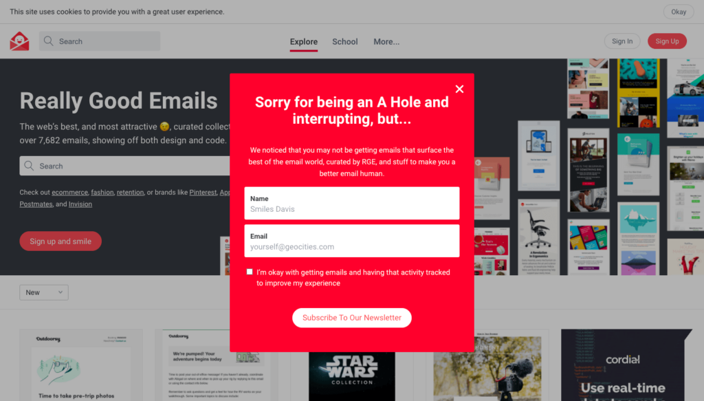
Email Signup 3: Pop-Ups/Modals on High Traffic Pages
Pop-ups (also known as “modals” to web developers, pronounced “mode l”) have a bad reputation. They send people back to a time without ad blockers, a time where UX on the internet was dominated by spammy advertisements. Despite the history of pop-ups, they are still used by brands big and small to convert web visitors into subscribers.
Pop-ups are still used because they are effective at capturing leads. According to Sumo, the average conversion rate of a pop-up is slightly above 3%. But to be successful, marketers must keep this interruptive history in mind. Before adding a pop-up you must ask yourself, “Is this worth making the site experience worse?”
Email Signup 4: Site Footer
Even though a visitor has to do a lot of scrolling to get to the footer, it is a valuable place to add a signup form. It’s valuable not because it is a high traffic section of your site, but because of the type of person who is interested in the site footer. The visitor who is interested in the site footer is either in love with your content or otherwise motivated to check out every inch of your site. Now that having a signup form in the site footer is so common, this could be the reason for a visitor to head to the bottom of the page.

Email Signup 5: About Page
The About page is an excellent place to add an email signup form. It is an important page for prospects in the discovery phase and is a highly visited part of your website. If your About page effectively builds confidence in your brand, this will help you capture early funnel leads.
This can be an especially effective placement if your newsletter reads like a “diary” from a company thought leader or even the founder of your company.

For example, Joe Lamp’l has one of the strongest personal brands in the gardening world, and he uses this relationship throughout his marketing efforts. His newsletter reads like a letter from a friend, addressing readers in the first person.

Conclusion
An email signup form must be included on a website to capture leads, but it’s up to marketers to include forms in a way that minimizes the effects on UX while still managing to collect valuable prospect information.
A barrage of pop-ups is a surefire way to irritate website visitors. But a relevant offer that pops up when a visitor has completed reading an article will surely capture leads. Generally, a subscription form on the sidebar isn’t going to ruin a visitor’s experience, but seeing the same form on every page of the website is probably excessive.
Consider this balance when placing forms on your site.
This article was originally published on Carbon Digital.